

Visual Identity
Package Design
Beautifully Crafted
Mast Market, a bean-to-bar chocolate brand, came to us seeking a packaging refresh that would honor their craft while standing out on crowded shelves.
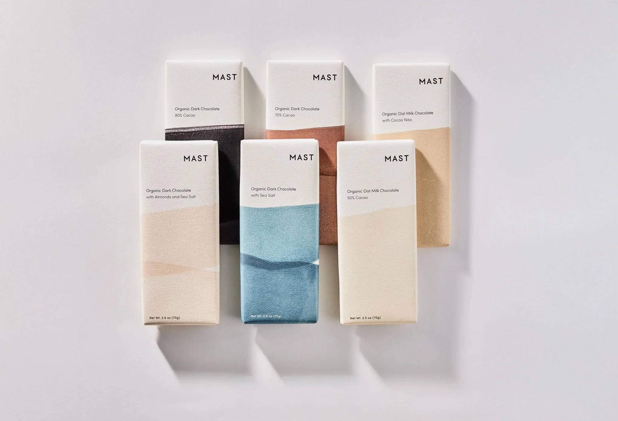
We began by collaborating closely with the Mast Market team on mood boards and inspiration, exploring what visually captured their brand essence. Through this creative dialogue, we landed on linocut prints as our artistic direction, a choice that brought a painterly, handcrafted quality to the packaging that mirrors the care Mast Market puts into their chocolate.
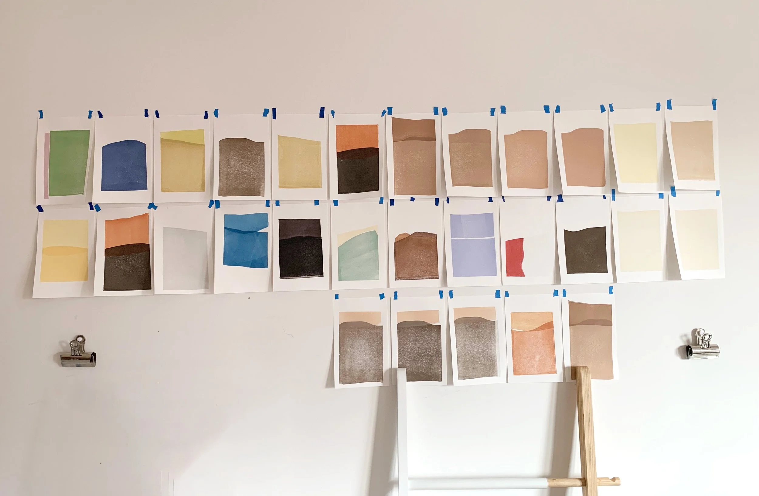
Creating the Color Story
Each flavor received its own thoughtfully chosen color palette. Through an iterative process of testing and refinement, we selected colors that not only distinguished each variety but also created visual harmony across the line.
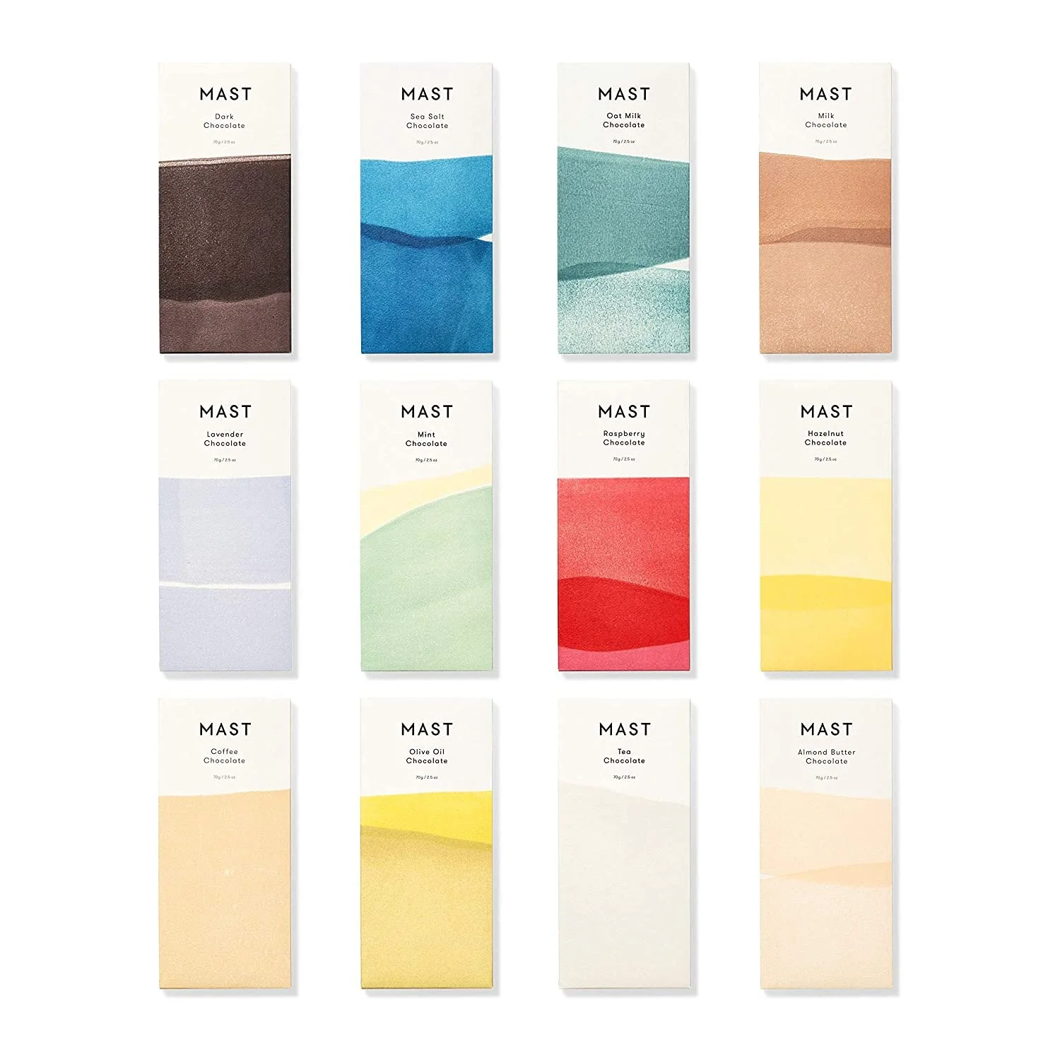
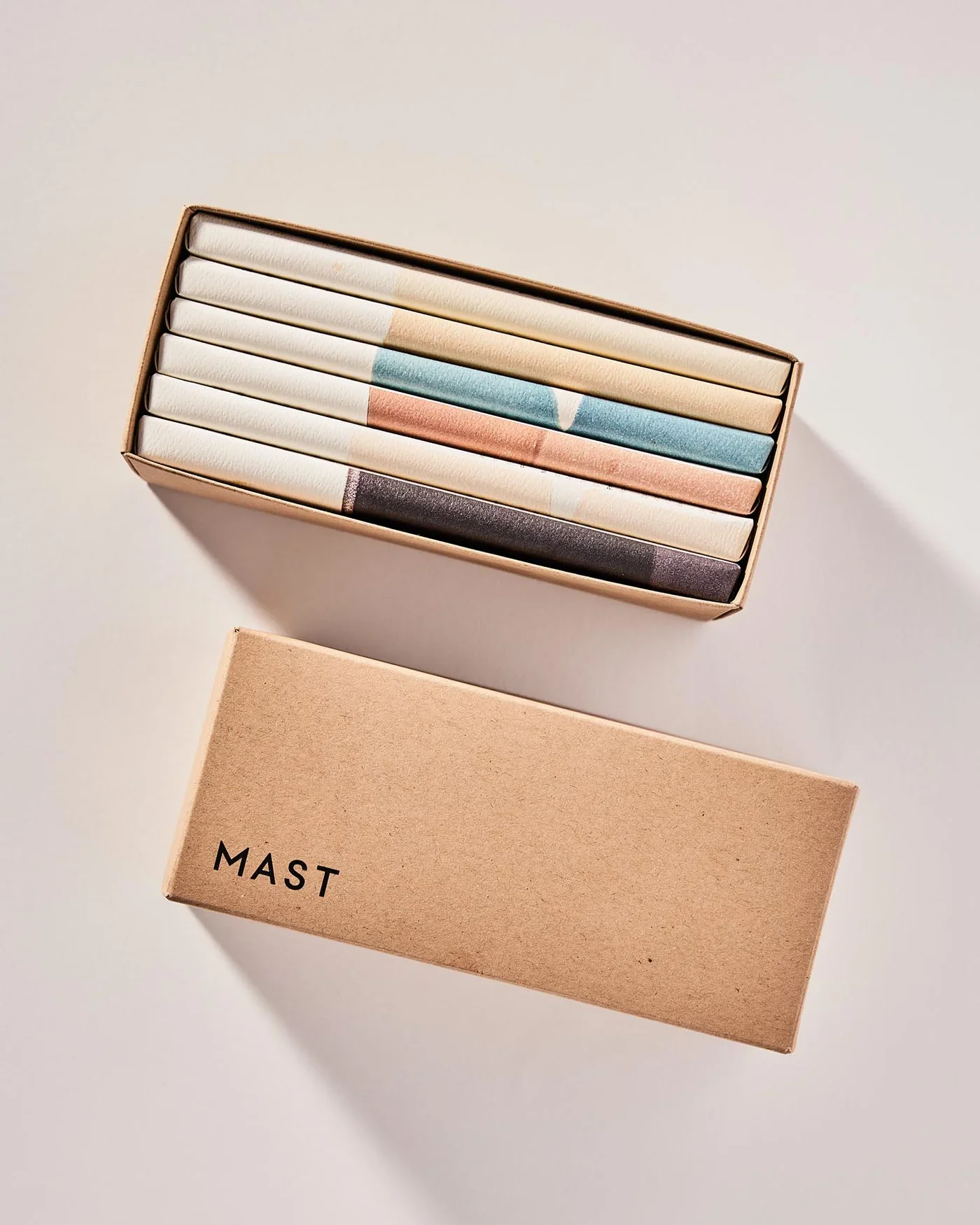
The final packaging brings together tactile quality and visual craft.
The linocut artwork plays beautifully against Mast Market's clean, modern typography. This contrast becomes the heart of the design: the organic, hand-carved prints meet crisp letterforms, creating a balance that feels both artisanal and refined. The packaging honors the craft behind the chocolate while standing confidently on the shelf, a piece you'd want to keep even after the last square is gone.
Featured work.
Mast Market
Visual Identity

Guggenheim Productions
Web Design
Osborn Shoes
Product Design
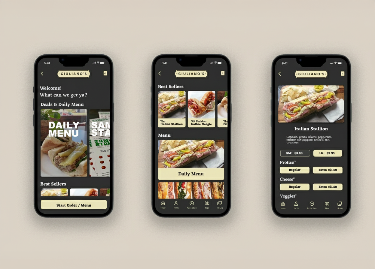
Giuliano’s Deli
Mobile Design